
Cloud Cost Explorer
Helps to understand spending on cloud tools: observe trends, make predictions, and optimize cost
Preparation
Success criteria
Before design work, I aligned stakeholders on success criteria for the first release
Stakeholders can reliably answer core questions: where money goes, what changed, and why it looks suspicious
The solution handles real fintech cloud data with its actual scale, gaps, and aggregation rules
Finance considers numbers consistent enough for reporting and budget conversations
Readability holds when group counts and filters grow

Discovery
Target audience
Enterprise companies (mostly fintech) with a large multi-cloud footprint.
They need visibility into cloud spend and usage across many teams, services, and accounts
Finance / FinOps stakeholders
- accountable for cloud spend
- need to explain variances and allocate costs across teams/projects
Engineering leads
- need to understand what drives usage and cost in their area
- need to spot anomalies early and plan budgets with confidence

Discovery
Problem context
The main problem was fragmented multicloud visibility: cost and usage data existed across different platforms and internal tools, but stakeholders lacked a reliable way to read it as one picture.
Pain points
No single source of truth for cloud cost and usage
Existing internal tools are limited and hard to use
Too much data gets buried without strong organization
Representative tasks
| Question | Cluster |
|---|---|
Cloud spend keeps growing and is close to our budget limit — what’s driving it? | Understand |
Spend jumped unexpectedly — what changed and what caused it? | Investigate |
Where can we cut cloud costs with minimal risk, and what’s the expected impact? | Optimise |
I see recurring spikes over a few days — what correlates with them? | Understand |
If the trend continues, when do we exceed budget, and what’s the end-of-period forecast? | Predict |
What changed this period vs the previous one, and what explains the delta? | Investigate |
What are the top cost drivers, and how big is the long tail (‘Other’)? | Understand |
How much spend is unallocated/untagged, and who owns the ‘unknown’ bucket? | Govern |
Can we break down spend by department/product/environment for chargeback/showback? | Govern |
A new cost center appeared among top spenders — what is it and who owns it? | Understand |
We plan a rollout/migration — how might it affect spend and what guardrails should we set? | Predict |
Is this spike real or noise, and which dimension best explains it for fast routing? | Investigate |
After an optimisation, did spend actually drop, and did it rebound later? | Optimise |
Are we breaching internal cost policies/limits, and who should be notified? | Govern |
Constraints
Very limited access to users and competitor products
Data-heavy UI with dense tables and many dimensions
Complex domain: FinOps, chargeback, forecasting, governance
Discovery
Benchmark
I benchmarked comparable tools and mapped the decision workflow around cloud spend. The analysis shaped information structure and key paths.
| AWS | Google Cloud | Azure | Harness | Apptio | CloudHealth | Spot | |
|---|---|---|---|---|---|---|---|
Multicloud | No | No | Azure & AWS | Yes | Yes | Yes | Yes |
Simultaneously multicloud | No | No | Azure & AWS | Yes | With service | Yes | Yes |
Tags | Hour | Hour | Hour | Hour | Day | Day | Hour |
Work without tags | Yes | Yes | Yes | Yes | Yes | Yes | Yes |
Regions grouping | Yes | Yes | Yes | Yes | No | No | No |
Recommendations | Yes | Yes | Yes | Yes | Yes | Yes | Yes |
Budgets | Yes | Yes | Yes | Yes | Yes | Yes | Yes |
Documentation | Yes | Yes | Yes | Yes | Yes | Yes | Yes |
Anomalies detect | Yes | No | No | Yes | Yes | Yes | Yes |
Event correlation | No | No | No | Yes | No | No | No |
Specialized FinOps tools, especially Harness, were the closest reference for multicloud cost visibility.
Native cloud tools had useful patterns, but mostly worked within their own ecosystems or required a custom BI layer for advanced analysis
Key decisions
Top groups and zoom-in
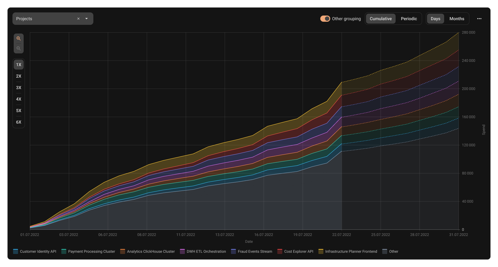
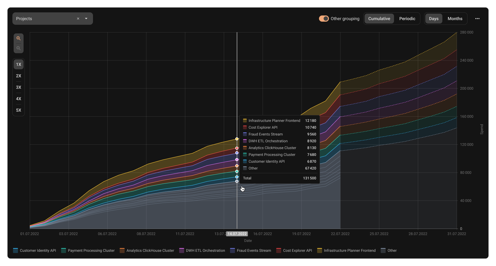
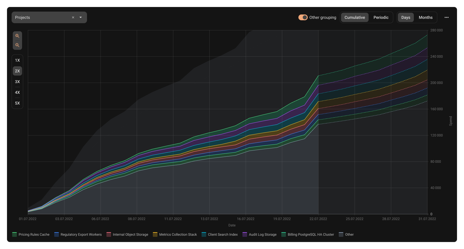
- Problem
Groups explode into hundreds of items and tiny segments. The chart becomes unreadable and insights disappear in noise
- Solution
Show top cost groups, group the long tail as ‘Other’, and let users zoom into it for more detail
- Advantages
Clear view of main cost drivers and their share of total spend
Chart stays readable
- Risks to avoid
Lower discoverability of the zoom-in interaction
Navigation friction between summary and detail
Key decisions
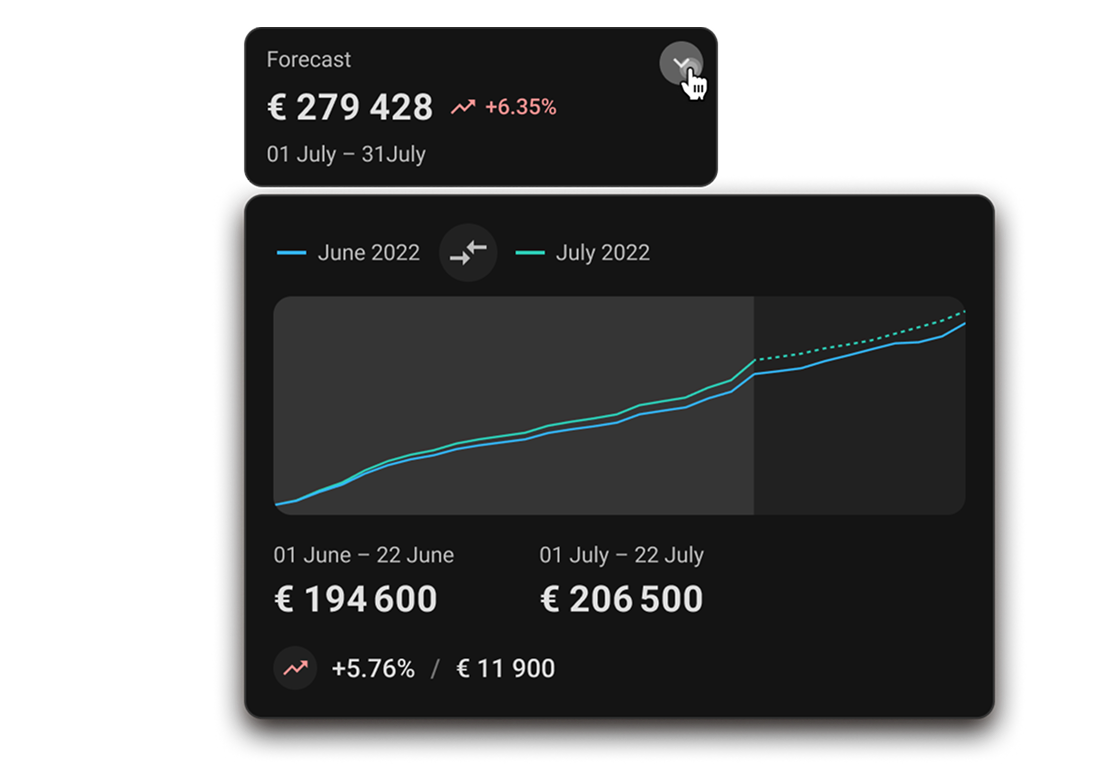
Cumulative vs Periodic

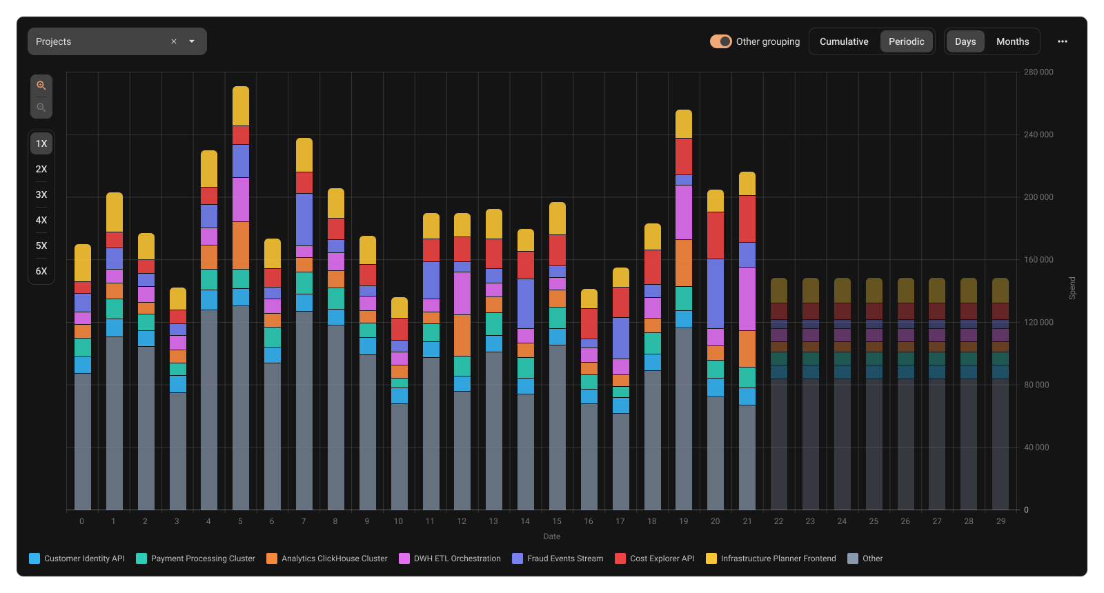
- Problem
To cover a strong visual sense of trend as well as a clear view of per-step changes
- Solution
A toggle between cumulative and periodic views
- Advantages
trend becomes visually obvious;
‘we’re heading to the limit’ understanding
spikes and repeating patterns are easy to detect
- Risks to avoid
The primary view could hide the other one
Key decisions
Chart linked with table
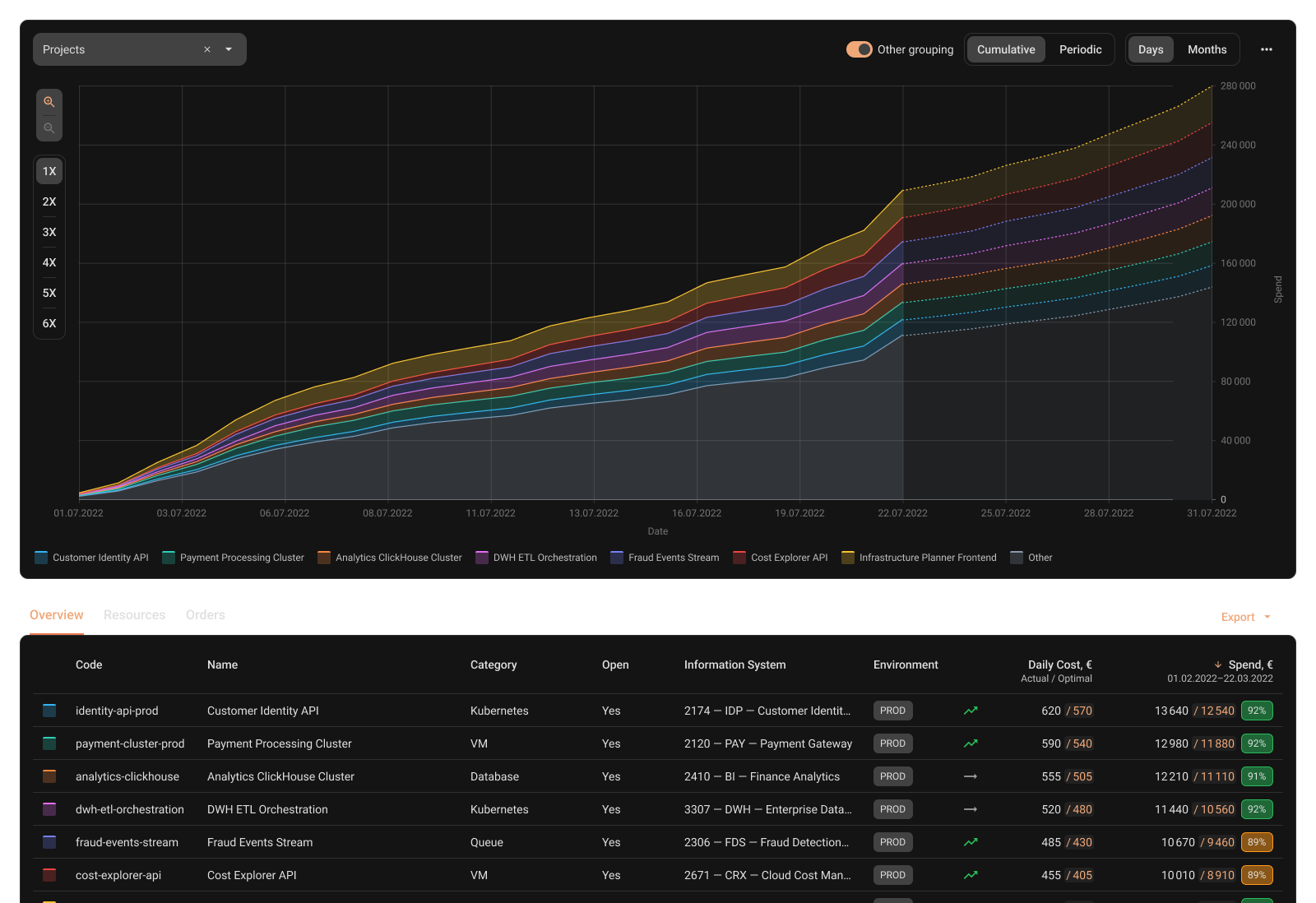
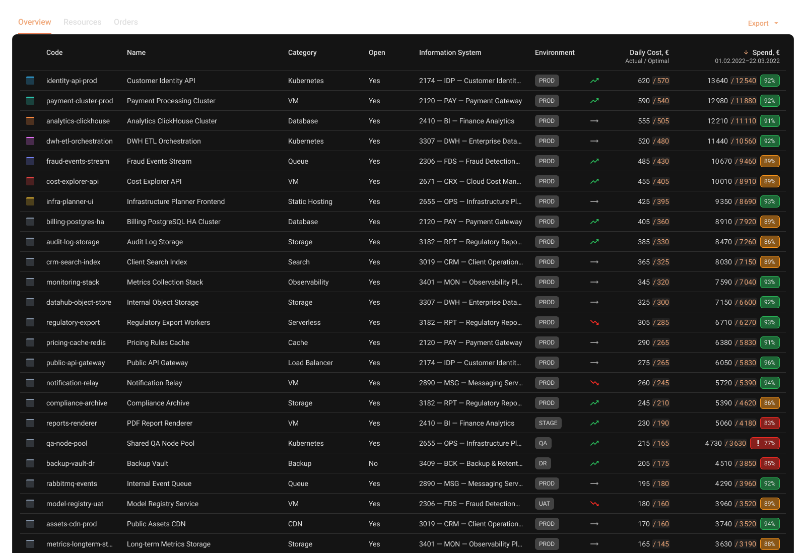
- Problem
Investigation needs both views: quick scanning and trustworthy detail. We can’t just hide some details, only prioritize
- Solution
Legend from chart connected to the table as well, but table contains much more details and entities
- Advantages
Fast understanding of ‘what matters’ via chart
Full accountability via table (no missing items)
- Risks to avoid
Chart/table mismatch caused by aggregation rules or sorting differences
Users losing orientation between summary and detail (weak linking / weak highlighting)
Key decisions
Filtering UX
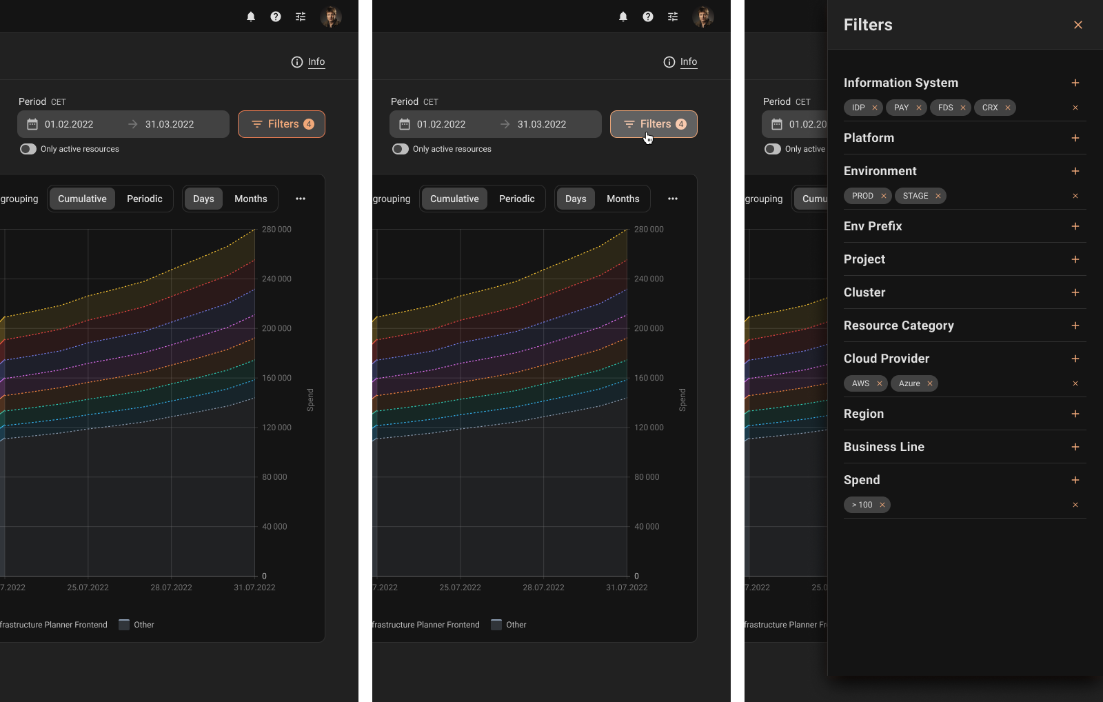
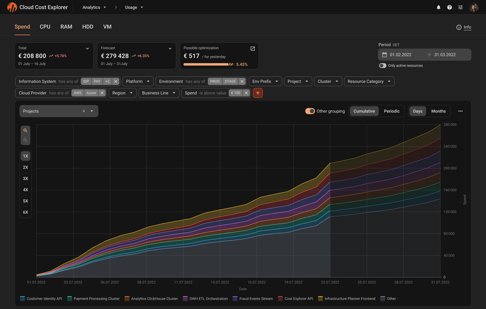
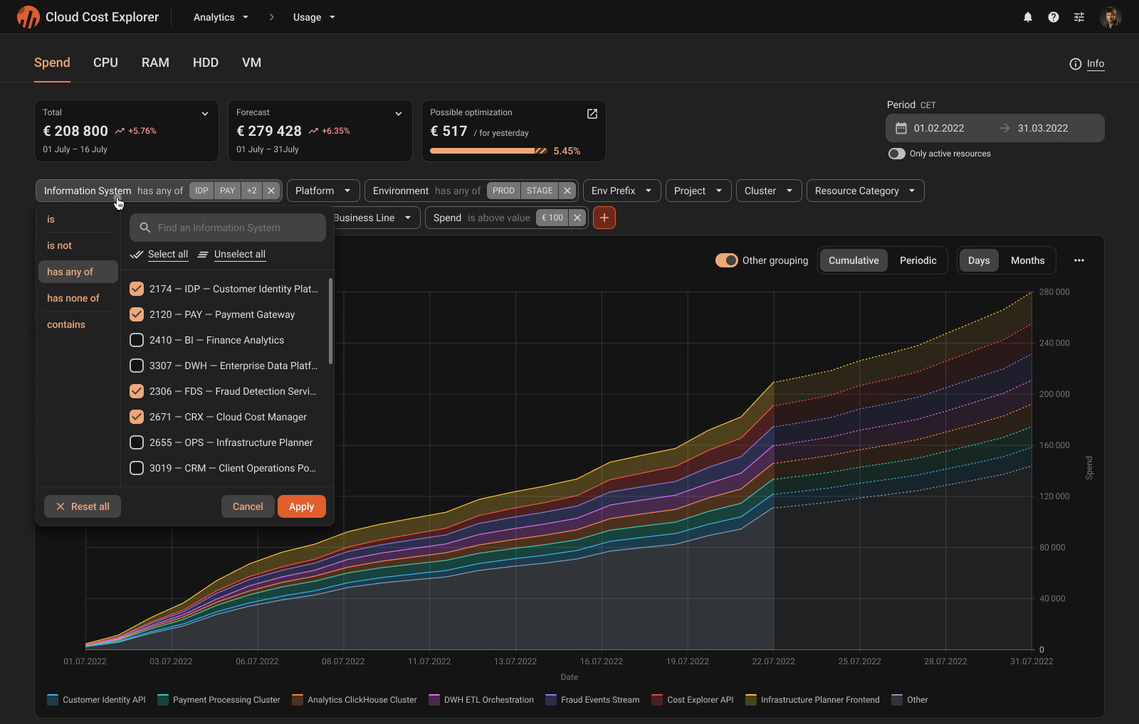
- Problem
Cost investigation depends on filtering by tags, accounts, projects, and regions. Users must keep a strong sense of what is applied right now, otherwise the chart becomes untrustworthy.
- Solution
Initial solution put filters into a drawer to handle many dimensions and filter types. After feedback, the flow changed so applied filters remain visible while reading the chart, and the interaction model stays consistent.
- Advantages
Scales for large filter dictionaries and lazy values
Applied filter state stays visible
Presets become a natural next step
- Risks to avoid
Inconsistent apply model
Key decisions
Overlay comparison
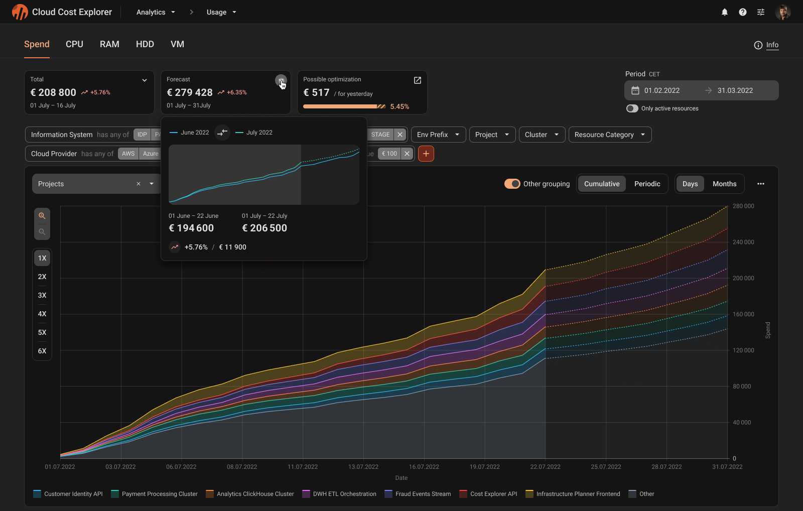
- Problem
Stakeholders need a reliable answer to whether current spend is trending above the previous period. Comparisons must stay interpretable across different time periods.
- Solution
Overlay current period and previous period data using consistent period rules.
- Advantages
Visual comparison that is easy to explain
Understanding of the global trend
- Risks to avoid
Inconsistent day counts for some periods
Impossible comparison with an unfinished period
Outcome
Launch the product
The MVP launched successfully and is now used in production with real data. The next steps are to iterate based on feedback and expand usage across more teams.
MVP integrated into a fintech environment and used with real data
Started an iteration loop based on initial feedback
Received follow-up requests to expand usage (additional departments)

Experience
What I learned
It was a big project with a complex domain and many constraints. I learned how to navigate such complexity, make informed design decisions, and align stakeholders around them.
Readability at scale: how to deal with data overload (how to prioritize data to generate insights)
How filters stop being ‘controls’ and become the product’s navigation system
Data logic is UX logic: period rules, grouping, and aggregation directly shape what users can understand and trust
Limited access to users: use every option to learn (like demos)
Thx for reading!
Feel free to reach out if you’d like to discuss this case, design decisions, or complex product interfaces
